|
Size: 1422
Comment:
|
Size: 2583
Comment:
|
| Deletions are marked like this. | Additions are marked like this. |
| Line 6: | Line 6: |
| /* CCLabel is the directive ,the text in the {} pair are the declearation*/ CCLabel { font-size: 16pt; } |
|
| Line 7: | Line 11: |
| Line 13: | Line 15: |
| font-size: 16pt; } |
|
| Line 16: | Line 20: |
| /*enabled, pressed and disabled CCDDPushButton will look different*/ CCDDPushButton::enabled { border-style: outset; border-width: 3px; border-radius: 10px; border-color: #948E8C; background: qlineargradient( x1:0, y1:0, x2:0, y2:1, stop:0 #ffe0cd, stop: 0.4 #ffb587, stop: 0.5 #ff904b, stop:1 #ff6200 ); } CCDDPushButton:pressed { border-style: inset; } CCDDPushButton:disabled { border-style: inset; border-width: 3px; border-radius: 10px; border-color: #949494; } |
|
| Line 19: | Line 48: |
| /*only CCBox with attribute CCColour equal "q" will affected by this declearation*/ CCBox[CCColour="g"] { border-style: inset; background-color: #DCEDE4; } |
|
| Line 24: | Line 58: |
| Line 26: | Line 59: |
| Line 29: | Line 61: |
| Line 31: | Line 62: |
| Line 33: | Line 63: |
| Line 35: | Line 64: |
| Line 37: | Line 65: |
| Line 39: | Line 66: |
| Line 41: | Line 67: |
| Line 43: | Line 68: |
| Line 45: | Line 69: |
| Line 47: | Line 70: |
| Line 49: | Line 71: |
| Line 51: | Line 72: |
| Line 53: | Line 73: |
| Line 55: | Line 74: |
| Line 62: | Line 80: |
| == 2, gui aad programs == | == 2, starndard control programs == {{attachment:qsssieat_labeled.png}} {{attachment:qsssieat2_labeled.png}} {{attachment:qsssieat3_labeled.png}} {{attachment:qsssieat4_labeled.png}} {{attachment:menu_labeled.png}} == 3, guiaad programs == {{attachment:qssstaad_labeled.png}} {{attachment:qssstaad2_labeled.png}} |
QSS on control explained
1, Basic concept introduction
a, basic format directive following by declearations.
/* CCLabel is the directive ,the text in the {} pair are the declearation*/
CCLabel {
    font-size: 16pt;
    }
b, more than one directives can be jointed for a declearation
/*CCListView, QListView, QComboBox, QPushButton, QMessageBox all have 16 pt font-size*/
CCListView, QListView, QComboBox, QPushButton,QMessageBox {
    font-size: 16pt;
    }
c, for some widget they have state can use ":" to indicate state.
/*enabled, pressed and disabled CCDDPushButton will look different*/
CCDDPushButton::enabled {
    border-style: outset;
    border-width: 3px;
    border-radius: 10px;
    border-color: #948E8C;
    background: qlineargradient(
       x1:0, y1:0, x2:0, y2:1,
       stop:0 #ffe0cd,
       stop: 0.4 #ffb587,
       stop: 0.5 #ff904b,
       stop:1 #ff6200
       );
    }

CCDDPushButton:pressed {
    border-style: inset;
    }

CCDDPushButton:disabled {
    border-style: inset;
    border-width: 3px;
    border-radius: 10px;
    border-color: #949494;
    }
d, can also select a widget by one of its attribute using "[" and "]".
/*only CCBox with attribute CCColour equal "q" will affected by this declearation*/
CCBox[CCColour="g"] {
    border-style: inset;
    background-color: #DCEDE4;
    }
e, when a property of a widget was not found in a more specific directive, the lest specific directive will be used.
/*all CCDDPushButton will have font-size 11pt*/
CCDDPushButton {
    font-size: 11pt;
    }
/*only the enabled CCDDPushButton will have the back stylish border and background*/
CCDDPushButton::enabled {
    border-style: outset;
    border-width: 3px;
    border-radius: 10px;
    border-color: #948E8C;
    background: qlineargradient(
       x1:0, y1:0, x2:0, y2:1,
       stop:0 #ffe0cd,
       stop: 0.4 #ffb587,
       stop: 0.5 #ff904b,
       stop:1 #ff6200
       );
    }
Examples
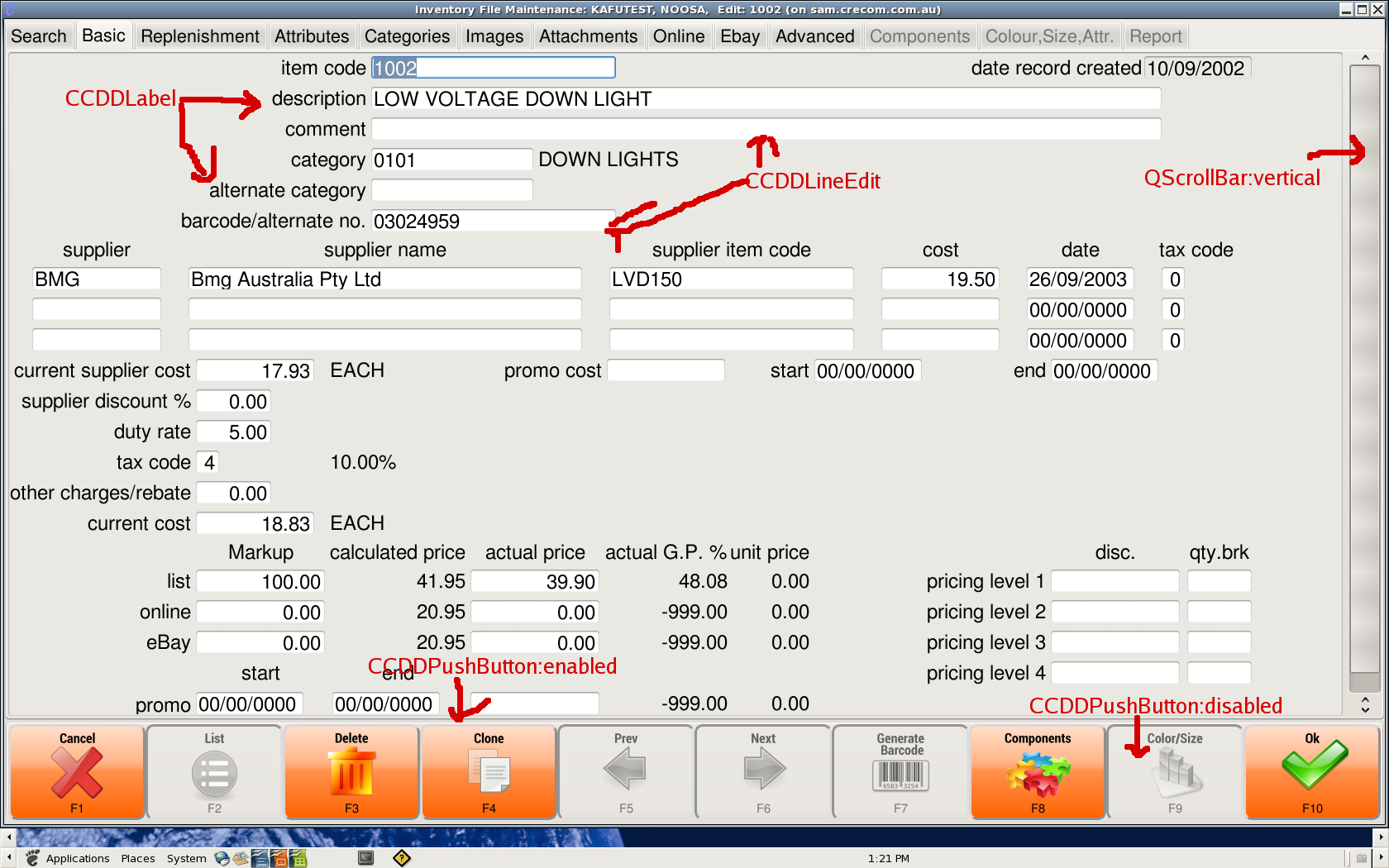
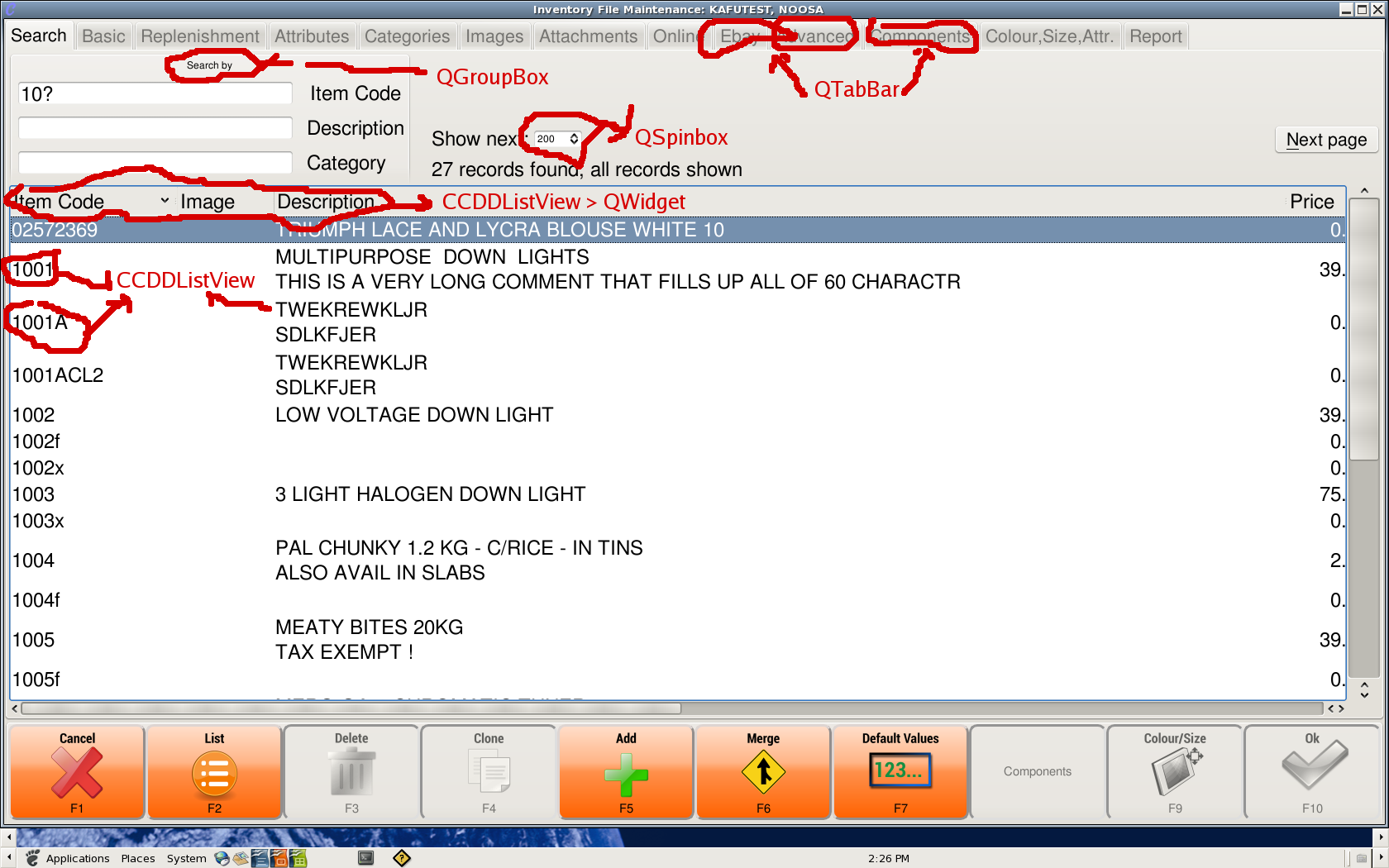
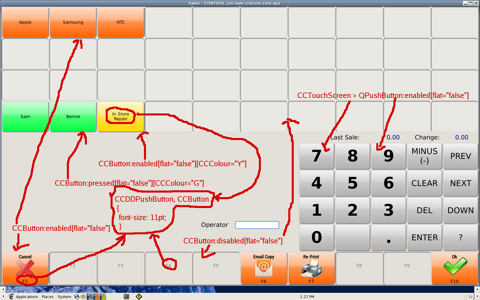
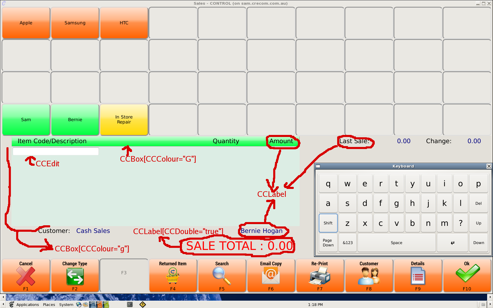
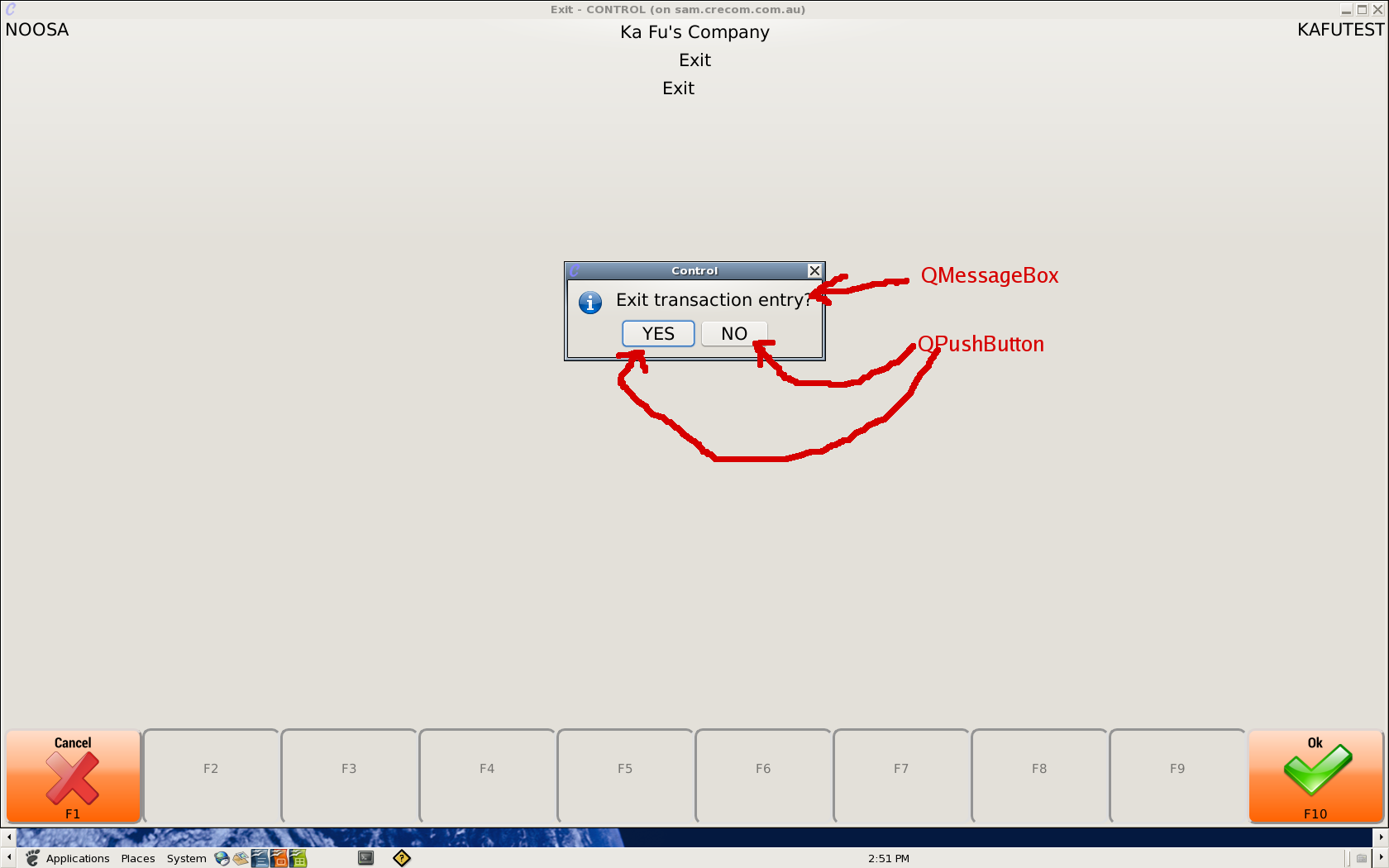
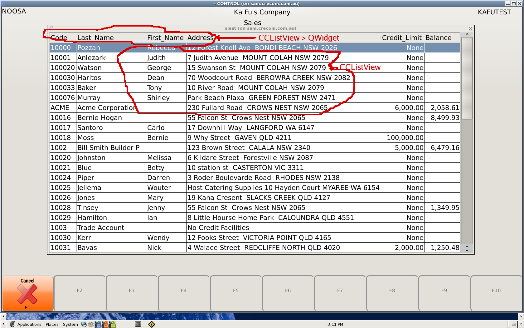
All the Red Text indicate the Directive with link to their Widget.
1, ccmenubar, ccexplore -- the menu programs.

2, starndard control programs
3, guiaad programs
